In today’s Lessons in Modern Art for the Modern Quilter, we mix it up with the “Wild Beasts!” … It’s Fauvism!

From about 1899 – 1908 a group of artists get even more bold with their color choices and the abstract nature of their art. The compositions of these paintings were simpler to accommodate the unnatural and vivid colors.

Portrait of Madame Matisse. (The green line) – Henri Matisse – 1905
There was no concern for if the colors were “realistic,” but rather if the paint choices represented the mood the artist was trying to convey. Here, the colors of the paints were chosen for symbolic purposes and to stir emotion.

La danse (second version) – Henri Matisse – 1909 – 1910
See the works of: Henri Matisse, André Derain

La Gerbe – 1953 – Henri Matisse
I want to include these pieces here, eventhough they were not created until the 1940s and 50s. In the 1940s Matisse became sick with cancer and had to undergo several surgeries. Life in a wheelchair did not hinder his art, as Matisse began to create beautifully vivid paper-cutout pieces called gouaches découpés.
I’ve always thought these pieces would make fantastic applique quilts : )

The Fall of Icarus – Henri Matisse – 1943

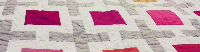
I also wanted to include a picture of this brilliant quilt (blogged here – image used with permission) as an example of the power of color choice. This is a beautiful blanket, made all the more stirring by it’s use of highly contrasting solid fabrics.
Although perhaps not unique to Modern Quilts, the saturated nature of solid fabrics common in Modern projects reflects the appreciation for vivid, bold colors found within the Fauvist movement.
Key Sources: theartstory.org and metmuseum.org